
The Subtle Role of Lettering
“Instructions for living a life: Pay attention. Be astonished. Tell about it.”
Lately I’ve been noticing the role that lettering plays in my journal pages. Not elaborate typography so much. Just small, handwritten words…names, dates, observations, all woven between sketches. Over time I’ve come to realise that these simple additions do more than label a page - they help hold the moment in place.
Over time I've realised how these small words quietly change the page and help cement what I sketch and paint.
Sometimes lettering is simply practical - a note or a label. But other times the words become part of the artwork itself. Like the title across the page that frames and brings all the elements together more cohesively.
You may notice this in the 'Old Windmill' journal page below (click on it to see the full page). The lettering becomes part of the composition, guiding the eye before it settles on the sketch.
Once you begin experimenting this way, lettering naturally starts to develop personality, and before long you realise you're exploring typography.
From Journal Page to Design
Typography is central to many forms of design. You see it in books, packaging and posters. But also in surface pattern design.
A hand-lettered phrase or quote might become the focus of a placement print (intentionally designed graphic or artwork, placed strategically, rather than continuously repeated). For many designers, this exploration begins quite informally in sketchbooks and journals where the pressure to "get in right" disappears.
That's what I love about journaling...it's an invitation to play and explore without having to "get it right" or "make it perfect".
A Small, Simple Practice
Next time you open your journal, try adding a simple title before you begin drawing, such as:
the name or location of the place
the plant or subject of your journal entry
a single word, phrase or quote.
And then try 'elevating' the title, word of phrase and elaborate on it to give it more interest.
Often the page begins to organise itself around those few letters. Or as is the case I find, is that I often add lettering after I've done a sketch/painting or two. There's no right or wrong. It's all practice.
In fact, as I start to explore lettering and typography, I'm beginning to think a little more about composition for my journal pages now, whether simple or elaborate.
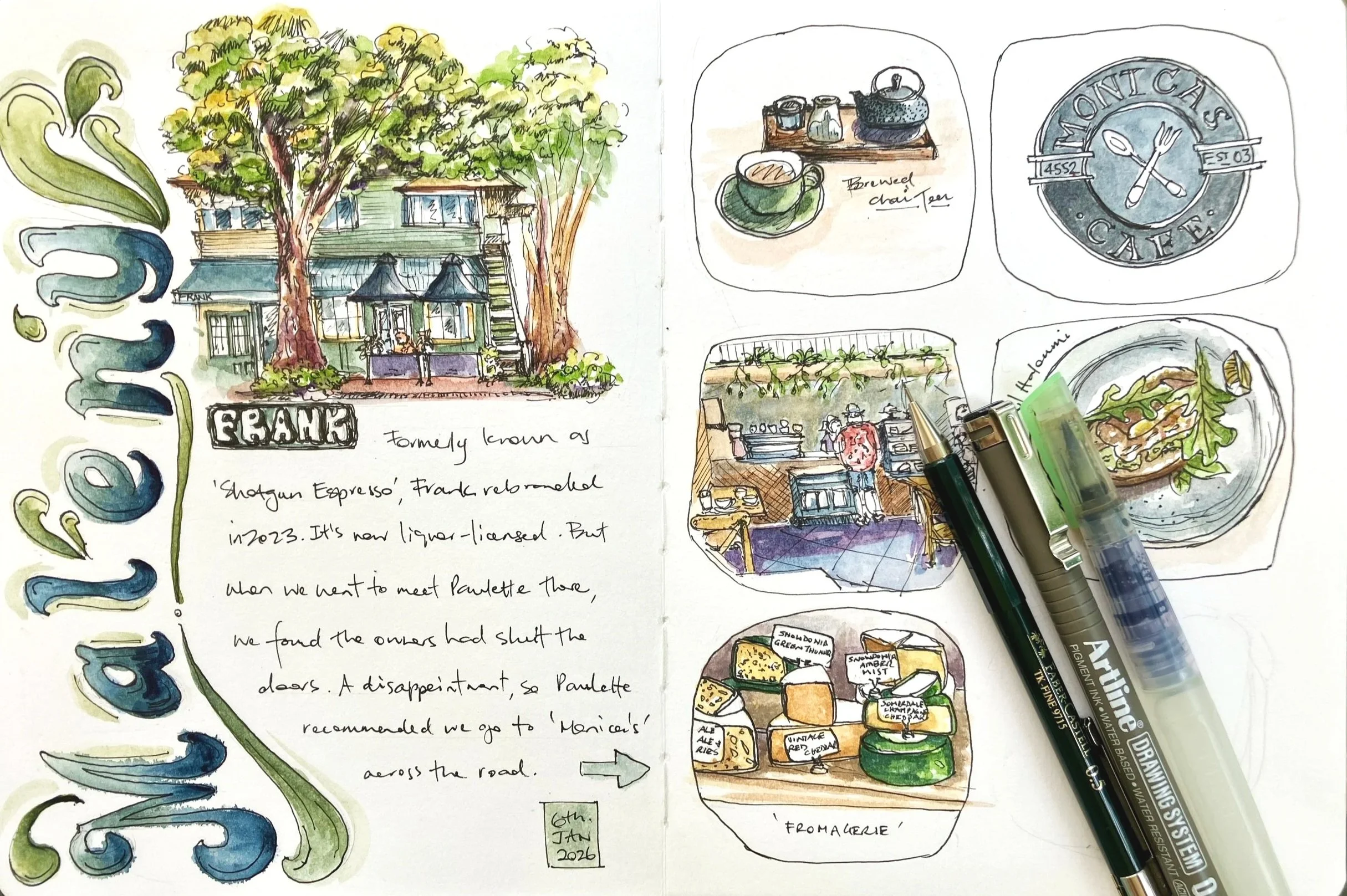
Of course, your entry doesn't have to be as elaborate as my 'The Old Windmill' journal page. Below are a few other journal pages where I elevated the title.
And here is a timelapse video of the process of pencil sketch to pen to adding watercolour lettering to a recent journal page.
Time-lapse of adding lettering and watercolour to a nature journal page
Do You Want to Explore Lettering Further?
If you'd like to explore lettering or typography a little more, whether you're into nature and art journaling or surface pattern design, here are a couple of wonderful free or low-cost resources I would highly recommend:
The Postman's Knock https://thepostmansknock.com/
I first encountered The Postman’s Knock many years ago when I began learning calligraphy myself. Their online courses and practice worksheets are broken into low-cost, easily digestible and practical offerings, make it easy to practice at home. The focus is on calligraphy and faux calligraphy (replicating the calligraphy look).
Brisbane Hand Lettering https://brisbanehandlettering.com.au/
Helen is a local Brisbane artist and pattern designer who offers regular meetups where you can practice hand lettering in a casual group setting. She also provides helpful hints and tips in her blog posts.
'Artistic Hand Lettering, creative handwriting for your journals' [Video] https://youtu.be/qfVZXreoQAk
A short video showing how you can add interest to your journals with creative hand writing. I like this video because it's less formal and more organic and intuitive where the emphasis and style is casual.
HANDY TIP: Next time you're out and about, look around you at the signs in windows, business and shop signs, streets and tags on things you buy or packaging. Check out the typography and think about how it reflects the feel and theme of the product or location. Practice and play with the lettering by implementing it in your own work or journal.
So the next time you sketch something, try adding a title or name, utilising some lettering or typography. Try something different each time and experiment, to see what you like. Over time, and with practice, you'll find a style that begins to emerge.